
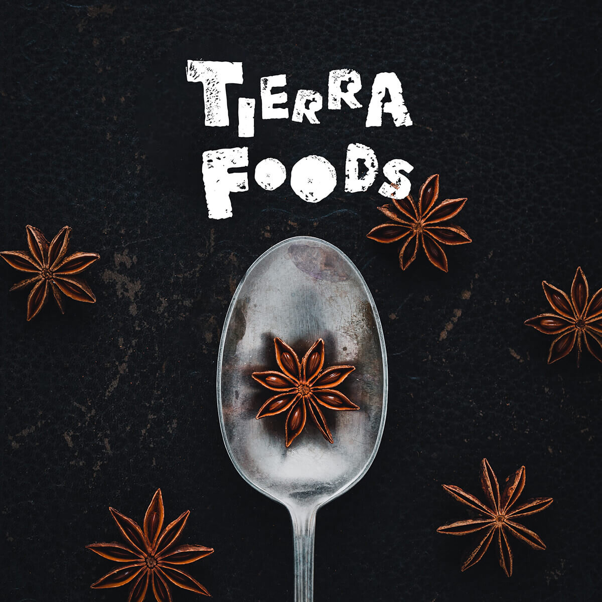


Branding for Tierra Foods
A foodie’s virtual emporium Tierra means earth or land in Spanish; it could also mean fine material of earth or rock – a fitting name for the purveyor of a carefully selected range of delicacies and traditional foods from Latin America and beyond.
A Singapore-based speciality grocery store, Tierra Foods provides a collection of gourmet pantry essentials including herbs, flour, spices and tortillas for the epicurious. As a providore of hard-to-find international ingredients, Tierra Foods is a bespoke merchant and distributor of authentic and diverse food products.
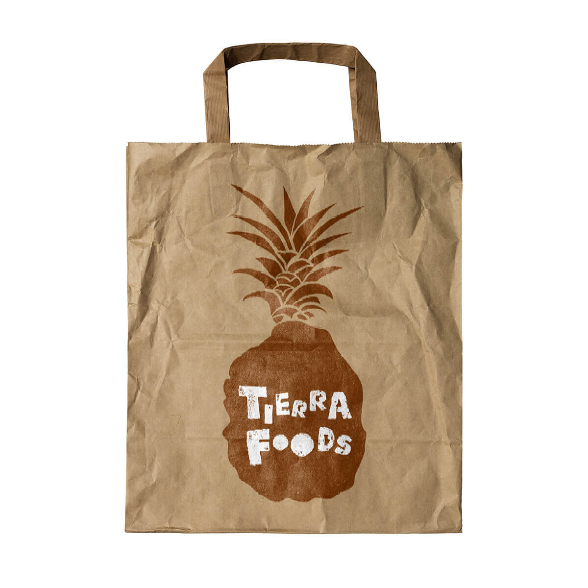
Logo concept: the pineapple: sweet symbol of the tropics and a staple of Mexican cuisine. The proposed logo features the tropical fruit in a hand-stamped aesthetic; encapsulating the essence of farm-to table and the hand-made and hand-picked quality of Tierra Foods. The lettering salsas with rhythm and energy – the ‘r’s have little round eyes looking across to the ‘a’ in Tierra.
The unique shape of the pineapple can be used across brand collateral in diverse, eye catching ways such as die-cut stickers, patterns and stamps that will make Tierra Foods stand out on any shelf.
The brand palette is inspired by the vibrancy of South America, and the rich, nurturing soil of the earth.
Delivered: Brand proposal, brand narrative